Tesco was one of several large clients with precise UX requirements at InMoment.
One of the interesting aspects of working on multiple large clients is switching back and forth between different identities, experience needs, and stakeholders. That means a client like Tesco had specific wants and needs based on their own research that didn’t always align with InMoment’s established best practices.
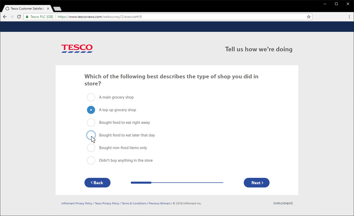
That means, however, that trends and changes in the industry are constantly being seen by designers at InMoment, and the “default” template applied to their software service was evolving all the time. Tesco thought the inflating progress bar was friendlier than the standard filled-in bar, an option we began presenting to other clients. One thing they took from us, was the suggestion of a paired down, single input entry page to encourage user engagement and prevent drop off.
Tesco Run Through.