Designing a single website for multiple audiences is hard, but the alternative is user frustration, dropoff, and brand confusion.
The previous design relied on overused stock photography, messy, poorly thought out user interactions, and unfamiliar design elements without repetition that didn’t serve the viewer well.
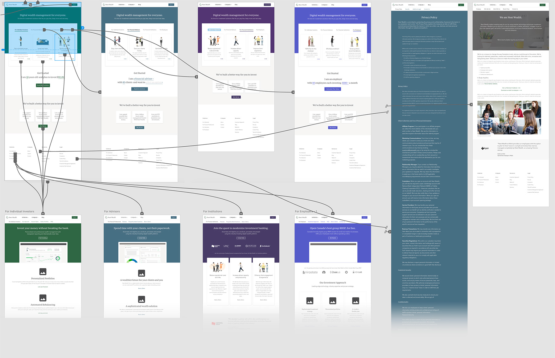
After user testing, dogfooding, and interviews, the best solution for a company servicing so many types of stakeholders was to deliver information to audiences instead of as a whole – taking uniform pieces and shifting visual cues to identify the user.
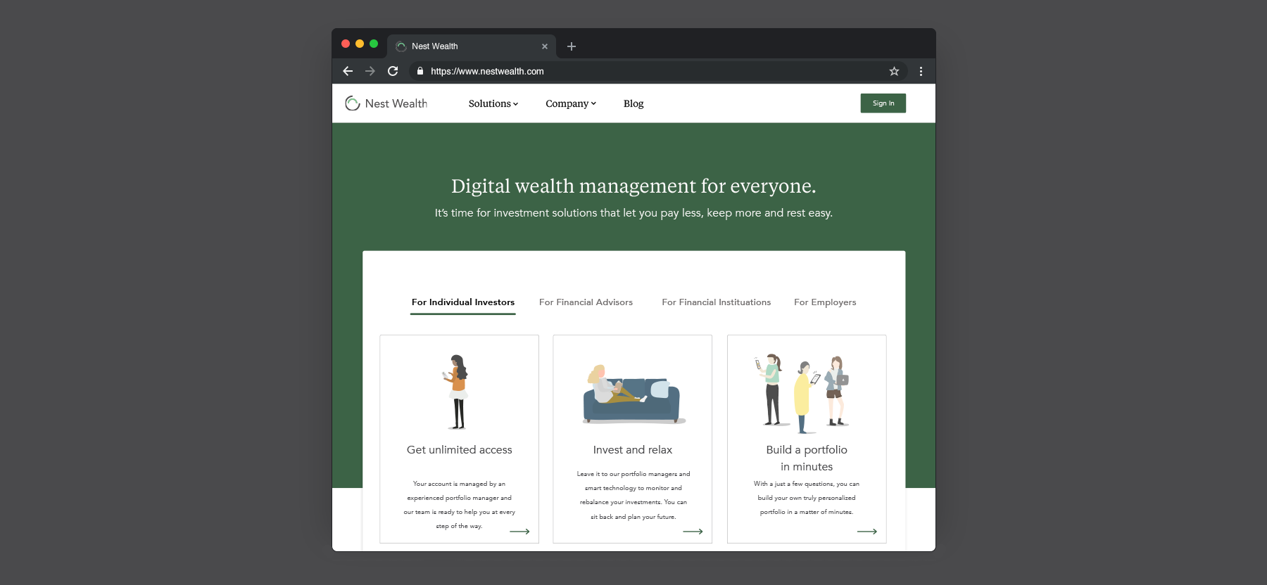
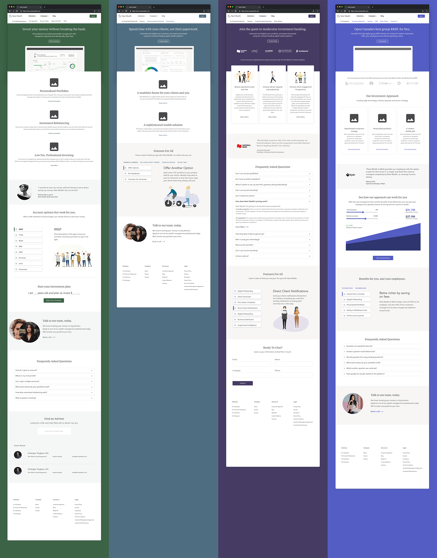
The site contains as much information as possible on a single page, but also simplifies and reduces the information thrown in front of the user. That means assessing all the data on the original site, removing repition, and creating content blocks that help the user get the information relevant to them as an audience member, instead of trying to tell the user everything that is encompassed by Nest Wealth.
A user selects who they are before they get overloaded with too much information – are they an individual investor, a financial advisor, an enterprise, or an employer? From there, the products relevant to them are explained in an integrated fashion.
User Flow Example