A brand inspired by kitsch, art deco, and spectacle, without becoming tacky.
Good Show Digital is a relatively young, boutique creative marketing firm in Toronto. They handle small and medium sized businesses, finding them the right connections and assets to properly brand and market themselves. I was asked to build a logo, brand guidelines, and help guide them in building up an identity.
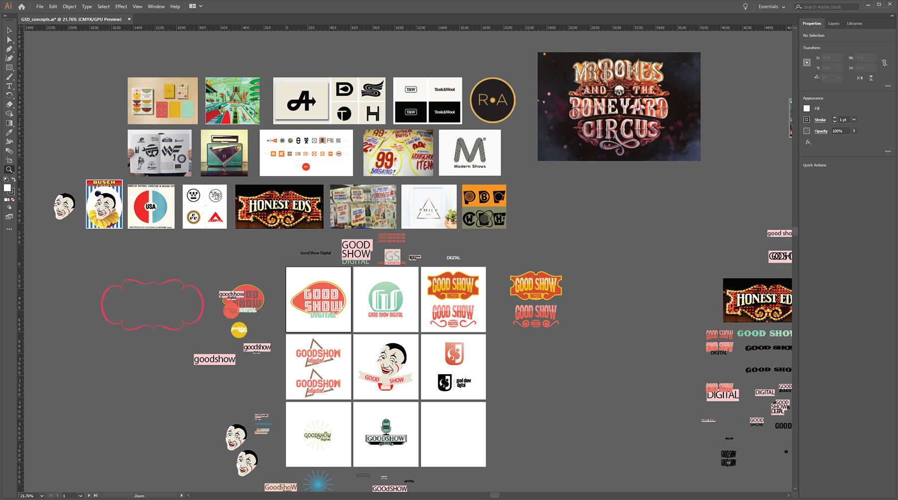
The brand grew out of collaboration with Good Show – what they initially wanted wasn’t what they settled on: their ask was an “Honest Ed’s” inspired tongue in cheek logo and identity.
However, they were quickly drawn to an alternative logo design that was presented, and a brand was built around that instead.
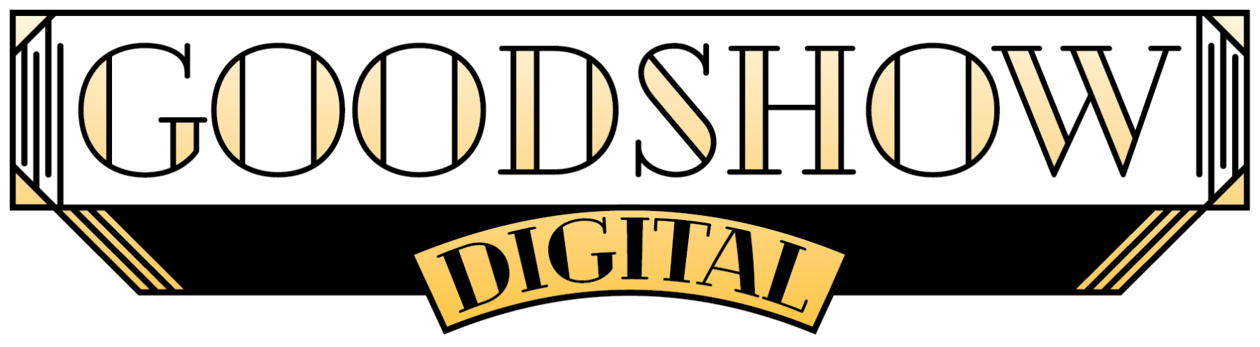
As a result, we took a hard turn and began to choose colours, fonts, treatments, and rules that worked better with an Art Deco identity instead.
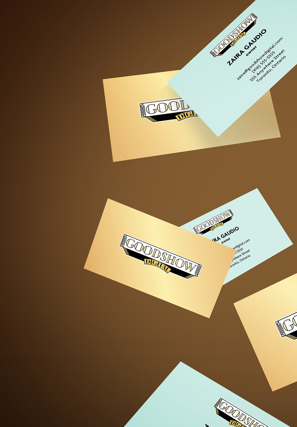
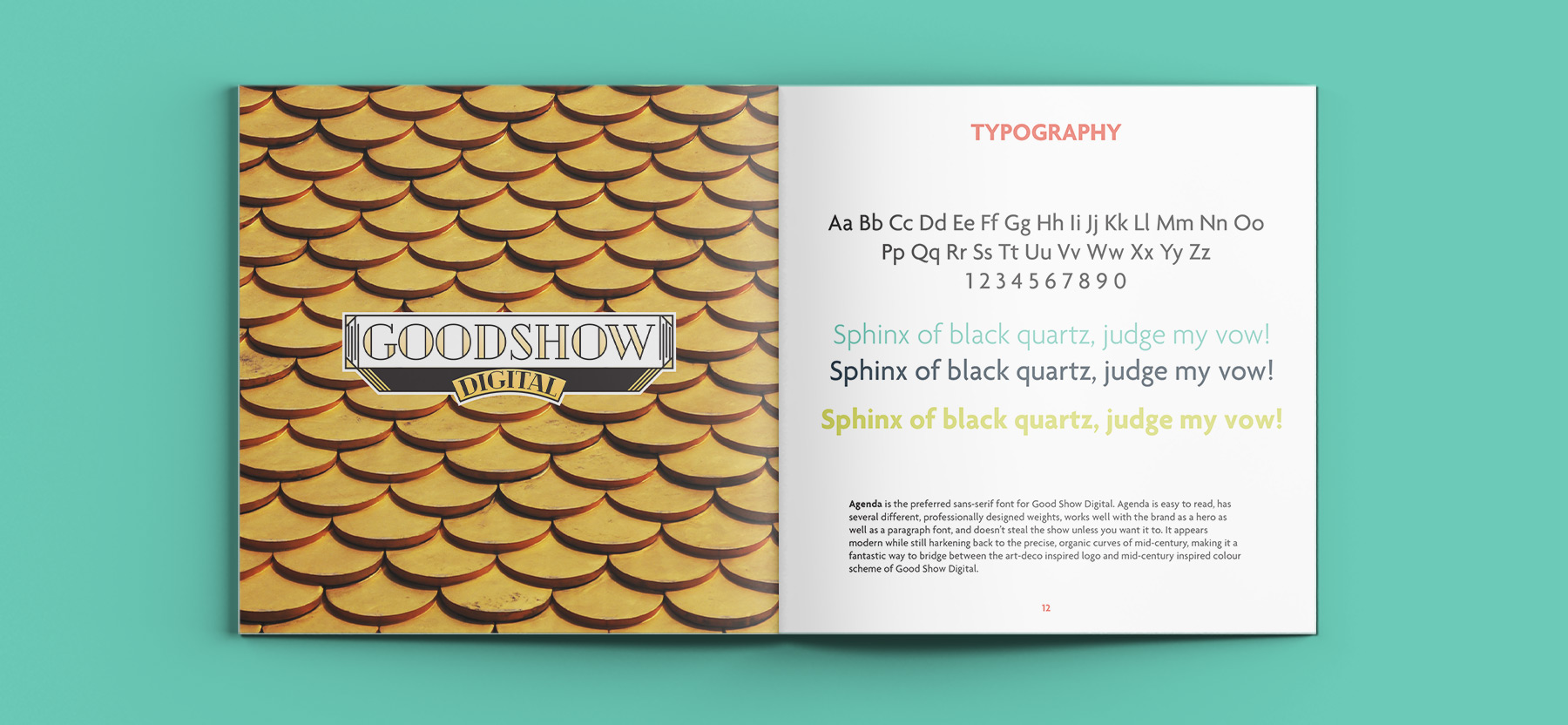
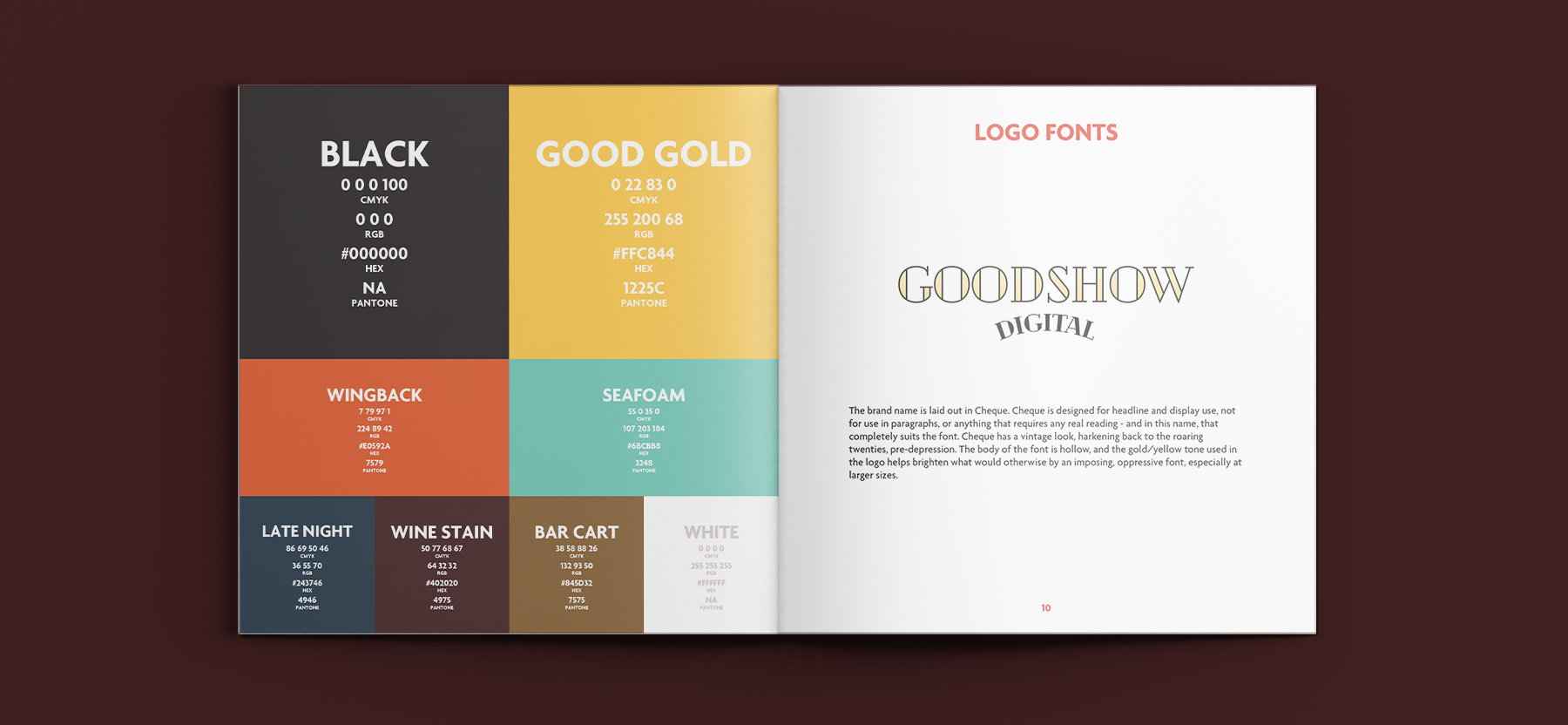
The result was a vibrant, playful logo that was light on it’s feet despite the heavy elements containing the wordmark. 6 colours were chosen, assigned a place in the hierarchy of the brand, and two fonts – Cheque and Agenda.
In total, the project took five months to complete. Three months were spent conceptualizing with the client, one month was spent finalizing small details, and the final month was spent creating all the necessary collateral, like business cards and brand guidelines.