Fulfillment seems simple at a glance – but adapting 25 year old software with 60 year old dependencies is a different story all together.
Bank of Montreal has been using the same co-piloting fulfillment software since the mid-90’s, updating it over time to ensure it followed regulations and process – but leaving the user experience untouched. That meant decades of user experience progress, left out entirely – the product employees use to fulfill customers gives the user too many options, overwhelms them with complicated jargon, doesn’t eliminate options that aren’t relevant, and relies on a non-linear tab based user interface to progress.
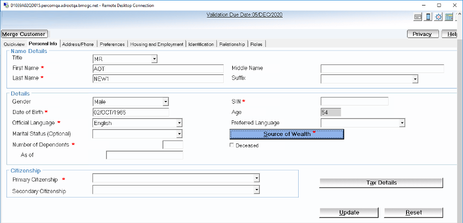
New employees in particular have a difficult onboarding process. During user interviews, I discovered employees with 6 months of experience were still unsure of themselves in the legacy product, and routinely called in managers, more experienced employees, or made critical mistakes that cost the bank time, money, and reputation.
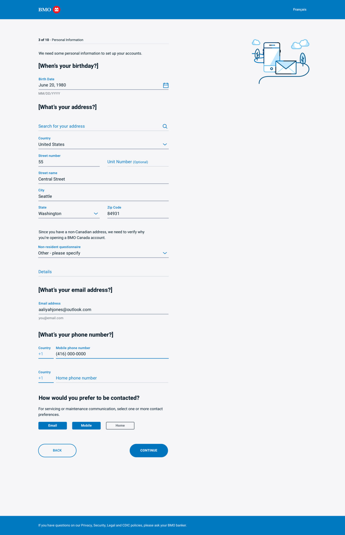
Those findings weren’t shocking, and when they were combined with other research that showed conceptual workflows that divided the forms into better categories, eliminated portions from being seen if they weren’t absolutely essential, and had simplified, human language that didn’t use bank-specific terminology unless necessary, the response from front-line employees was relief.
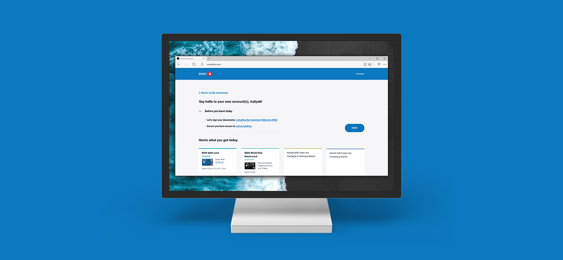
Our team came to a decision to create a linear, page-by-page user experience that eliminated all non-essential information gathering, and skipped or hid any pieces of the flow that weren’t relevant to the products being fulfilled. So, for example, if your customer sitting with you wants a chequing account, why would we ask them about their yearly income? You don’t need to, so our product wouldn’t.
In addition to simply creating a better fulfillment process, the product also had to seemlessly match and integrate with an existing product, Needs Navigator. That meant not only solving for the containerized problems of fulfillment, but also ensuring Account Onboarding Transformation (AOT), felt, and had matching interactions, with Needs Navigator. I worked closely not just with my direct team, but also the Needs Navigator team as their product released, and most closely with their User Experience designer to modify, match, and choose the best experience across the board.
In it’s current state, AOT will likely bring time spent on technology from 60+ minutes, to 20-30 minutes. This frees time for employees to better know their clients, fulfill more items per transaction, and removes pressure from both employees and customers who no longer need to know and understand complicated processes.
Considerations
- Research on different ways of displaying and exploring information, as well as best practices for displaying forms, breaking up portions of the flow into digestible pieces, progressing through a heavy, information-gathering process, and how to justify that to stakeholders, developers, and both direct and adjacent teams.
- User testing internally with employees. Activities like 5-second tests, card sorting, A/B testing, high-level question and answer periods, and presenting intentionally confusing experiences to test for and remove positivity biases.
- Working within a relatively new and evolving design system, contributing to it and justifying new ideas that would become a part of that system, and adapting existing elements to new situations – while still remaining consistent with a myriad of active projects throughout the bank.
- Transitioning from physical workspaces with access to all relevant teams and projects, to a completely remote environment while still ensuring communication, creativity, and efficiency weren’t impacted, thanks to COVID-19.
- Designing for a co-piloted experience: AOT needed to be readable and visually stimulating to both an employee and a customer, and accessible on multiple devices, primarily desktop computers and iPads. That meant careful language considerations, no complicated UI elements that would make sense to one audience but not another, and serious consideration when it came to accessibility and customer security.
This project launches at the end of 2020. As time has gone on, employee feedback both within the bank and on front lines during testing has gone from constructive to overwhelmingly positive.